Building A Successful Web Site
What makes a good web site in the modern world?
This discussion was created from a talk on Building A Successful Web Site during YES week
, for
NACET , June 18, 2014.
Presented by Darryl Brown of 2b design and development
Provide Value
Why would anyone come to your site? You must provide value to your users.
value:
- Give your users something they can actually use!
- Make it relevant to your topic.
- Value is the ultimate SEO tool.
- good
- www.mcmillanrunning.com
- bad
- rense.com/
Be Purposeful
Define your purpose. What are you trying to accomplish?
Your purpose should inform all major design decisions.
Define:
- what the site is about and
- how should you interact with it
- good
- www.google.com
- bad
- themagicofbaltimore.co.uk
Prioritize Visually
Narrow goals on each page.
Strongly consider a "call to action", which forces you to prioritize.
Focus:
- One main concept is ideal and
- Make priorities visually obvious using size, color, and graphics. Avoid equal weight of priorities.
- good
- www.crazyegg.com/
- bad
- www.arngren.net
Content is King
Designers often make the design most important. This is...bad.
The design priority should be the content of the site: the text, images, videos, functionality.
It does not imply boring!
design:
- Make subtle design elements
- Favor simplicity
- good
- www.craigslist.com
- bad
- www.pennyjuice.com
Great Usability
What is usability? Making the site easy, simple, and functional.
Throughout your site:
- Be consistent! Do not change the link colors or menu. Keep a strong, consistent design vocabulary for your entire site.
- Type must contrast (pleasantly) with background. Check your contrast at this site.
- Few (one?) main concepts per page.
- Functionally correct.
- Don't make people register up front. Present substantial functionality before requiring registration.
- good
- youtube.com
- bad
- www.libertyvan.com
Make Web Pages Scannable.
Web users do not read, they scan web pages.
scannability:
- Use headers to differentiate topics.
- Use bold and emphasis to draw attention to key phrases and ideas.
- Use lists whenever appropriate to break the flow and draw attention to key items.
- Important stuff first. The first two paragraphs are essential on a web page. These must contain the most important information that your visitors are looking for.
- good
- www.amazon.com
- bad
- cavs.mit.edu/
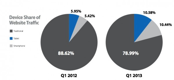
Use Responsive Design
Designs respond to the screen size they are viewed on.
Screen are getting bigger,
Old standard width was 960 pixels.
In fact, in january 2013, over 80% of all screens were larger than 1024 pixels x 768 pixels. w3 schools browser display statistics
And, screens are getting smaller
mobile browsing is climbing - almost doubling last 12 months. from smartinsights.com
- good
- this site!
- bad
- trendlines.ca
Alternatively, separate designs
Create different designs for all major device sizes.
Costly and not robust.
Search Engine Awareness
Search engines are the gateways to the web. You must cater to those engines.
SEA minimums:
- Provide value to your users. Content and functionality that provides value is the best long term SEA principle.
- Use text for text. Using images or flash or other graphics for text will defeat search engines.
- Content defines search terms. Using meta tag keywords is not sufficient and is becoming obsolete. You must have content on your site that is relevant.
- Schema data. Google (and others) use schema data which identify parts of your content as specific types of data, e.g. organization name, phone number, address, etc.
- Responsive design. Google (and others) expect sites to be mobile friendly and penalize you for not adhering to that.
Biggest Mistakes
Excerpted directly from webpagesthatsuck.com
- Believing people care about you and your website.
- A man from Mars can't figure out what your website is about in less than four seconds.
- Contrast (http://www.checkmycolours.com/).
- Using design elements that get in the way of the sale.
- Navigational failure.
- Site lacks MUST HAVE Content.
- Too much material on one page.
Thanks!
Presented by Darryl Brown of 2b design and development